Background
Following EasyPark’s acquisition of PARK NOW, tens of thousands of B2B customers needed to be migrated from legacy web platforms into EasyPark. With a different UI and some missing key features, there was the potential for user frustration and high customer care contacts.
Goals
Prioritize only essential functionality to keep migration scope manageable.
Make key tasks clear and intuitive to reduce confusion and support contacts.
Improve UI consistency to boost user confidence and benefit existing users.
Outcomes
+46%
MAUs
Role
Led the end-to-end UX/UI design process.
Collaborators
Worked closely with 3 product teams to shape required features. Also collaborated with user research and sales to discover user needs and test designs.
Audience
B2B fleet managers in the Netherlands.
Main tools


Jump to
Problem
Missing legacy features
EasyPark had the goal of migrating all Dutch B2B customers from legacy platforms but they used a number of key features that EasyPark didn’t have. Attempting migration without implementing these features would lead to frustration and potentially customer churn, putting user retention and revenue at risk.
On top of that, customers would be moved even though they didn't ask for it, so if they couldn't easily understand where to find things in the new platform, they would add to the frustration and possible churn.
Make it easy to adapt
With these problems in mind, my goal for the design was to ensure that migrated users had an easy time adapting to the EasyPark platform, could quickly find the pages and actions they regularly needed and felt they could continue to do their job effectively.
Discovery
Researching user needs
To meet my goal I needed to work out which missing features were needed and how customers used the legacy platforms. Product and user research focused on putting together a list of feature gaps to close, while I reviewed customer feedback, account structures and usage data to help understand user behaviour and create a list of design priorities.

Scope limitations
I also met with the sales team to gather insights about customer needs and problems with the legacy platforms. They brought up some valid points, like missing the ability to manage employees in bulk, and I made sure to share these with other stakeholders but the already large scale of this project meant that anything not considered key to migration needed to remain in the backlog.
Ideation
Designing with constraints
The broad scope of this project meant UI changes had to be kept minimal and new features needed to fit seamlessly within the existing design.
To help ensure this was achieved, I produced two design artifacts to help me gauge the bredth of the design work and uncover questions early:
An IA diagram to position new features and functions within the UI in line with what I'd uncovered about usage.
User flows to start getting a high-level idea of how actions would work within the EasyPark platform.
Some features were simple, while others, such as employee parking, introduced complex branching flows so mapping them out was a great way of uncovering issues and questions early on and sharing them with product and engineering.

An opportunity for small improvements
Once we had broadly aligned on the IA and user flows, I moved on to throwing together a variety of mid-fidelity mockups to see how everything would actually appear.
Despite the limited scope, I wanted to include some small UX improvements that I felt would benefit not just migrating customers, but existing ones as well. This included changes to button positions on table pages like Vehicles and Users where currently I saw two issues:
Key actions like "Add vehicle" were positioned in-line with table filters and created a busy and squashed UI even on some desktop screens. I proposed moving key actions in-line with the page title and utilising fill buttons for the primary page action to help better group actions together and improve responsiveness.
Table export options were displayed as 4 separate buttons but were not frequently used (and most users only exported to PDF), which created a lot of visual noise. I proposed condensing export options into a single dropdown button and using a text button over an outline button to again reduce focus.

Testing
Validating our assumptions
It was important that we validated my designs with actual users, particularly ones who used the legacy platforms on a regular basis. So with the help of Sales, we arranged to visit 9 users at their offices in and around Amsterdam for user testing sessions.

Testing goals
Check that we hadn't missed any features the participants felt were valuable.
Identify usability challenges.
Assess users overall feeling about the transition.
Mixing prototype and production
Testing was interesting as we wanted to get feedback on new features being designed as well as existing features already present in the EasyPark platform. This meant we needed to provide a prototype as well as a test production account.
We tried to structure the test so that participants went through the prototype first and then move to production but I made sure to link from the prototype to equivalent pages in production just in case users clicked on certain navigation options.
Key findings
Implementation
Maintaining designs over time
After testing, I made a few tweaks and reviewed with stakeholders before preparing the final designs for handover. However, while I was able to do a lot of the design work in one go, development was spread across a number of quarters so it was important that I provided detailed documentation and annotations to guide developers, including:
Explanations of pages and dialogs to provide clarity around purpose and expected user interactions.
Specifications for complex components like text and select fields, which were particularly important to help ensure good keyboard navigation support.
Directions on handling errors to support both usability and accessibility and standardize messaging.
This approach helped keep implementation aligned with user needs despite shifting timelines and made it easier for myself as well, as there were a few occasions where designs were impacted by subsequent projects and I needed to revisit the migration designs and update them to ensure that developers weren't working on outdated mockups.

Outcomes
The challenge of gauging impact
Migration was incredibly complex and was done over a long period of time as it required moving hundreds of thousands of accounts.
Due to the scale it was hard for me to gauge the exact impact of my designs but I made sure to regularly check-in with Product and Sales to review feedback and a few things seemed clear:
Contact rates remained low, helping customer care and sales support manage their backlog.
Transaction and revenue retention remained stable, though continued work was needed to meet and exceed expectations.
Post-migration analytics
I also made sure to regularly check our analytics tool that also showed some encouraging data once migration was finished, indicating strong adoption from users:
MAUs increased by 46%.
Key action usage increased by 40%, such as adding employees and starting parking sessions.
Developer feedback
I also received feedback from several developers who commented that my design specs and annotations made their UI work much easier as it removed guess work and meant less disruption as they didn’t need to stop and get clarification as much.
Learnings
Reflecting on the project
Low-usage features aren't unimportant
While prioritizing high-impact features was necessary, a few small functions that were frequently used by a handful of large accounts were skipped over. The absence of these features led to inefficiencies during migration and addressing these gaps earlier could have improved the transition experience for several important customers.
Page vs dialog for longer forms
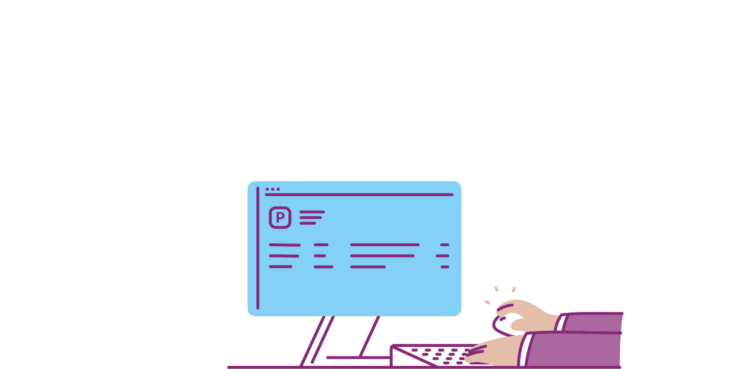
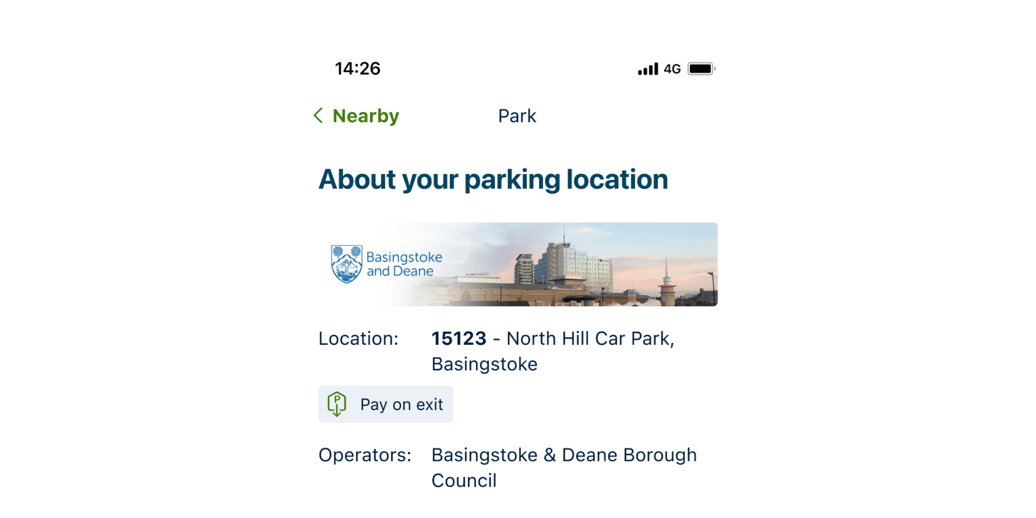
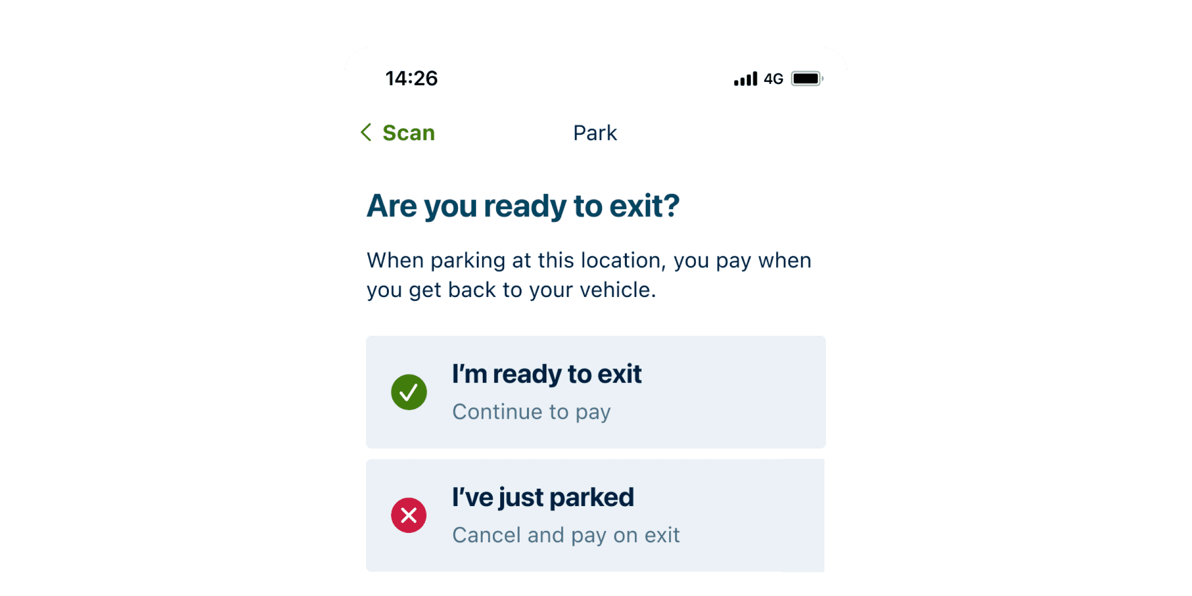
Prior to this project, the start parking session action was launched from a separate page within the main navigation. I chose to bring that form in-line with other important actions in the platform by moving it within the "Parking sessions" page, having it launch from a primary button and appear in a dialog box.
I felt the benefits were clear:
It's what legacy users expected.
The action is directly connected to the Parking sessions page as you can see active sessions from the table there.
It's a more consistent key action experience for existing EasyPark users.
However, the form can get busy (depending on which parking area is selected) and requires the user to scroll the dialog to complete the form, which goes against UX guidelines for when to use dialogs and could be a point of frustration for users.
I wasn't able to explore this possible issue in-depth but if I had the opportunity I would look at usage numbers, check with customer care and speak to users to see if they identify any problems with the flow of parking employees and guest.